The logo colors of retail
Harness the psychology of color to build your brand.

by Pinch Studio
All colors are retail store colors
The spectrum of the retail industry is as wide as a rainbow. You have price ranges from dollar stores to luxury car lots, styles from black tie attire to children’s party supplies. You have department megastores, niche specialists, vintage resellers, and connoisseurs. With all the diverse retail business models and each of their unique goals, every single hue and shade on the rainbow is part of someone’s optimal retail store colors or retail logo colors.
That’s not to say colors aren’t as important in retail. In fact, quite the opposite: colors for retail stores allow you to show the world what kind of store you are and what separates you from your competitors. A quick glance at your logo, website or in-store decor can tell a shopper what style, price range and personality your products offer just by what colors are prominent. In retail, color choice is more than just aesthetic — the right colors can actually help you close a sale!
Which retail store colors will attract the customers you’re after? We went through our backlog of over 600 graphic design projects for the retail industry and analyzed their color palettes and the brand personality traits our retail clients were after. We then had our color psychology experts add their two cents and organize the data. What we learned is displayed below, to help give you a headstart in choosing the best retail colors for your unique brand.
Which colors for retail stores turn into gold?
-
 The most popular retail store colors in 99designs and among industry leaders, set next to their popularity across all industries. All data visualizations designed by MH Designs.

With a diverse industry like retail, each color is represented, at least a little. The most popular colors all-around were blue and red, with black and white as the most used secondary accent colors.
Brown, purple and pink are all uncommon choices: these colors are considered to be niche, as in certain demographics love them but all other demographics hate them. That makes them strategic if they suit your niche, but a poor choice for general retail — pink is perfect for a candy store, but ill-advised for a department store catering to everyone.
What was most interesting to us about this data is the discrepancy between the retail colors of the industry leaders and the colors our retail clients requested. For example, red is a clear favorite of retail leaders, composing an impressive 59% of retail store colors and retail logo colors. For retail store colors, red is applicable to almost every type of vendor. Just look at the diversity of the top retailers that use red: Target, Staples, Macy’s, PetsMart, Ace Hardware, GNC, Guitar Center, etc. However, only 20% of our clients requested it.
Perhaps the phenomenon reflects the recent global growth in smaller niche retailers, where modern store-owners want to venture away from “crowd-pleasing” colors like red, white and blue (it’s just a coincidence that they’re patriotic).
Davids and Goliaths: comparing the retail logo colors of industry leaders and newcomers
By now we hope we’ve impressed on you that it’s not the colors themselves that are good or bad, but how they fit into your unique business strategy. Let’s take a look at four very different schemes of retail logo colors and how they suit their specific company.
First, one of the biggest names in retail, Walmart. Their logo is great to start with because it’s simple, effective, and by the book. To understand why their logo works, you have to understand their business goals: Walmart targets the general population with a value proposition of lower prices. These two points are reflected in their retail colors of blue and muted yellow.
Blue is a welcoming color, so if you’re targeting the general population, it’s a smart choice. The darker shades of yellow, as well as some shades of orange, denote affordability and inexpensive products. Putting it all together, you see that Walmart chose their retail store colors with care.
Compare Walmart’s logo to that of its biggest rival, Target. Considering that they’re the two biggest retail chains in America, their logos are surprisingly different, showing just how much business goals influence branding colors. As opposed to Walmart’s catering of “everyone,” Target caters slightly more to younger shoppers—or shoppers who want to feel younger. This is clearly evident by their heavy use on the color red, the most youthful color, as we explain below.
Nordstrom is not as mainstream as Walmart or Target, but it still sells at the national level. Their business goals are very different than the previous department stores — Nordstrom is committed to being on the cutting-edge of fashion, and delivering the best possible service while doing so.
You can see the contrast in their retail colors: Nordstrom’s retail store colors, logo colors and website colors almost always center around black and white, a sophisticated color that looks way more upscale than Walmart’s blue. Nordstrom’s lower-price chain, Nordstrom Rack, lightens their logo color to a shade of grey to appear more accessible.
Finally, let’s look at a retail giant that takes more of a middle ground with their brand colors. While not as popular across the States, budget supermarket Aldi has been a long time European favorite. Interestingly, they found a way to combine the intensity of warm colors like red and orange with blue’s serenity. Blue is the dominant color here to appeal to the general population, but highlights of red, orange and yellow around the frame give it a more powerful presence without going as bold as Target. The use of gradients, which came as part of Aldi’s rebrand in 2017, modernizes the brand while remaining recognizable.
Finding your aisle: showing brand personality with retail colors
Start determining your brand personality by asking yourself these six questions:
- Gender: Is my brand traditionally masculine or feminine?
- Tone: Is my brand playful or serious?
- Value: Is my brand luxurious or affordable?
- Time: Is my brand modern or classic?
- Age: Is my brand youthful or mature?
- Energy: Is my brand loud or subdued?
We'll use your answers to see what logo color works best for you.
Here's how retail businesses on 99designs define their brand personalities:
-
We analyzed the preferences of all industries and assumed normal distribution. Preference strength was figured on number of standard deviations from the mean.

As expected, the diversity of the retail industry prevented any one trait from dominating. In fact, most every trait was neutralized when we examined the retail industry as a whole. However, the clear takeaway is that all retailers have a slight preference towards a youthful appearance. That’s a fascinating revelation, considering that all retailers regardless of their differences have at least one thing in common.
We asked our color experts about youthful retail colors, and here’s what they gave us:
We asked our color experts about youthful retail colors, and here’s what they gave us:

Based on their answers, we’re not surprised to see red is highly associated with youth. After all, our data above found red to be the top color among industry leaders.
The other “youthful” colors are less flexible. Purple and pink, as mentioned above, are niche colors so they only apply to a small number of brands. Orange is more accessible, but its playfulness tends to subvert more formal or sophisticated brands.
The breadth of the retail industry means that you can’t rule out any one color completely. However, it also means that, to narrow down this many options, you must define your brand personality beforehand.
Color-coded closers: how retail colors improve sales
When you’re choosing your retail logo colors and overall branding color scheme, remember that each color represents specific emotions and personality attributes. A company that wants to appear fun and cheap benefits from a different color scheme than one that wants to appear professional and high-end. Below is a graphic of these kinds of color associations:
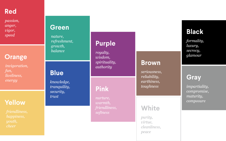
What we’re trying to say is, what you’re selling and whom you’re selling it to should determine your retail store colors. Red, blue, black and white are the most popular choices, but that doesn’t mean they’re best for your brand.
To illustrate what we’re talking about, let’s look at two different samples of the same logo concept from a 99designs logo design contest. Bambini Bear is a new baby product retailer that wanted a logo with a cuddly bear motif.
To illustrate what we’re talking about, let’s look at two different samples of the same logo concept from a 99designs logo design contest. Bambini Bear is a new baby product retailer that wanted a logo with a cuddly bear motif.
-
Logo design by H88DESIGN.
-
Logo design by Ade G for Bambini Bear.
This first logo concept (on the left) is objectively a good logo: the casual typography suits the brand message, the bear mascot is sufficiently cuddly and the style fits the market. The color choice isn’t bad either: by making the brown of the bear a golden hue, it softens the more negative connotations of brown and adds the friendlier and more energetic properties of yellow. All of those work for selling baby products.
However, the contest winner (on the right) took the concept in a different direction. Straying from a naturalistic approach (in the wild there are no blue bears), the designer drew more from marketing principles — namely that blue is a color of welcoming and friendliness, making it more appropriate for a baby product retailer than golden brown. Add that to the mother-child mascot team and simplistic typography, and you see why Bambini Bear chose this logo over the runners-up.
For smaller niche brands just like Bambini Bears, color choice is doubly important. Big brands can draw on their past reputations, but new or small retailers need all the help they can get establishing their brand identity.
-
Logo design by Sava Stoic for Metal Horse.
-
Logo design by Project 4 for The Organic Basket Co.
Take Metal Horse’s orange logo (above), a perfect fit for a retailer selling handcrafted metal, wood and leather pieces. The bright but rustic hue instantly tells you that this is a brand focused on unique but affordable craftsmanship, before you even read the name.
Niche brands also have more leeway to “break the rules.” Even the unpopular colors like brown—the weakest association to the “youthful” retailer trait—can still have their moment. The Organic Basket Co. fosters a rustic, old-fashioned brand identity to appeal to eaters of organic food. Their pottery-clay brown is more generally appealing than a darker brown, but still distinct enough to conjure associations to wood and soil.
Of course, we’ve just been covering the basics of color theory here. In practice, designing with colors involves a lot more insight than we have time to get into. That’s why many retailers like Bambini Bear above have opted to hire a freelance designer to take care of their branding colors for them.
At 99designs, we make it easy to find a designer that fits your company’s style and values. Use our Designer Search feature to filter designers by industry, and find the perfect retail designer for your brand.
Blue collar, white collar, purple collar: what are the logo colors of other industries?
Get a retail logo design now!
Want to know more about how design impacts business?
Subscribe and be inspired by our best tips, trends and resources.
We'll also send you the occasional marketing email and promotion (which you can opt-out of anytime).