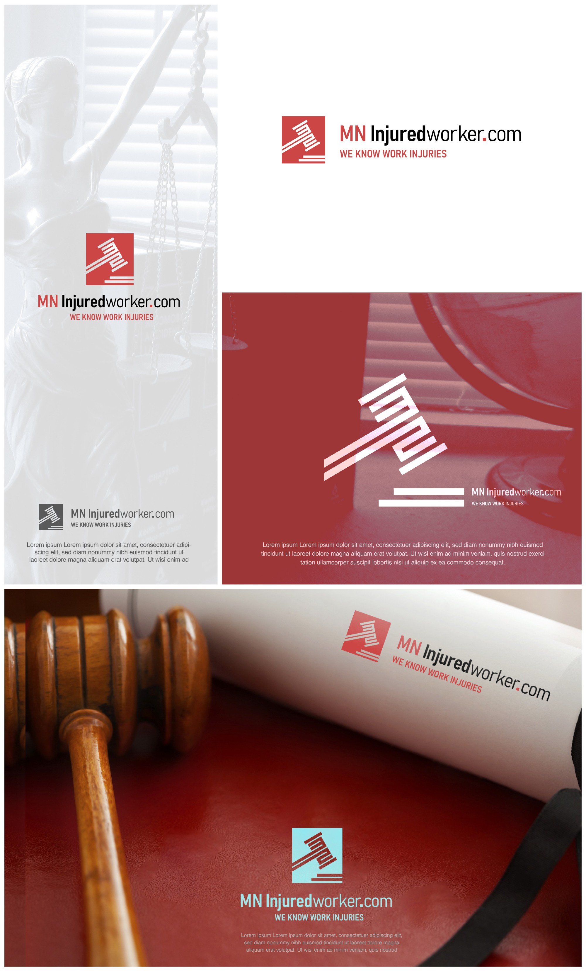
A modern monogram Gavel logo for a Law firm.

1
Created on 99designs by Vista
The way the letters "MN" are shaped into the gavel is a smart and thoughtful detail. It makes the logo feel more personal and connected to the brand, almost like it was made just for you.
This design isn’t just about looking good; it’s about making sure the logo tells your story and sticks in people’s minds. It’s a subtle but powerful way to show that you’re all about helping Minnesotans with their work injury claims.