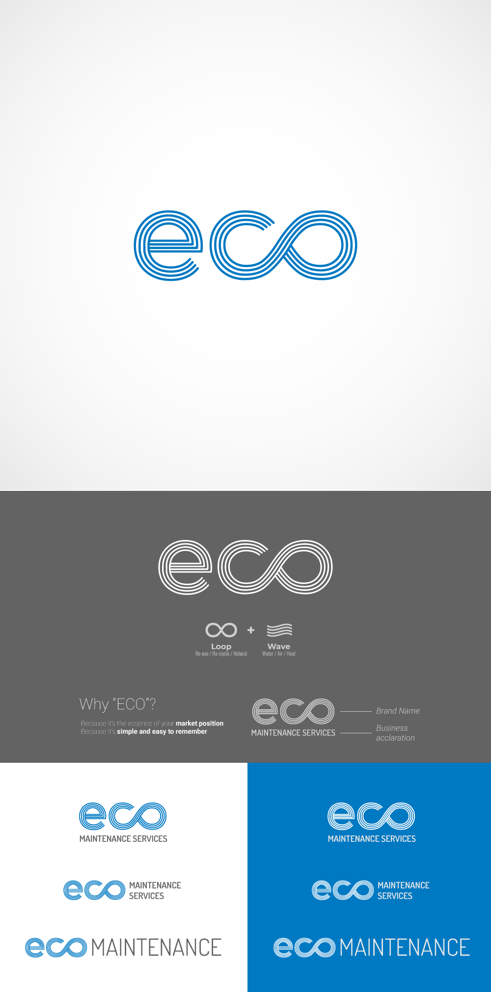

• In client's brief, the wordmark was "Eco Maintenance Service".
As it was too long, I decided to work with "ECO" as the wordmark and "Maintenance services" as the clarification of the business.
This way, it becomes easier to remember both the name and the logo.
• The graphic resource of the lines, is there to represent almost abstractly what could be understood as water, wind, heat; both 3 present in any cleaning process.
• The light blue color is there in the first place; because it is easily identifiable with the industry. The green color was not used, because "Eco" alredy has a strong meaning towards ecological.
• To reinforce the idea of ecological, it was decided to work with the loop, which is strongly associated with the theme. It could be said, if you will, that it symbolizes the kind of products you use; whereas when it returns to the ecosystem, it does not harm.