
Created on 99designs by Vista
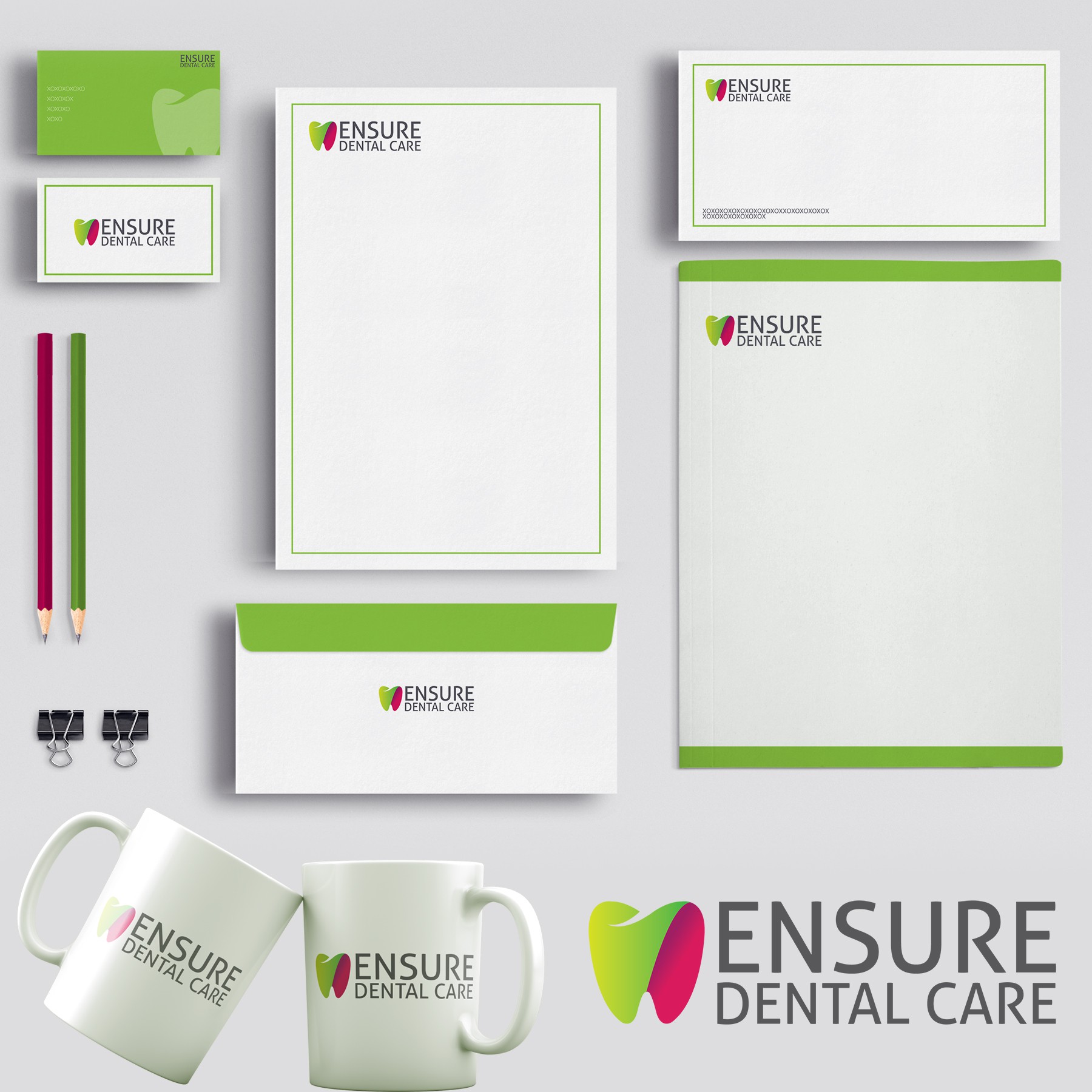
As per the brief the symbol of tooth was to be included in the logo. When designing I kept that point in mind but I also wanted to make the design modern and eye catchy. So I divided the tooth in 2 parts giving it a circular form and allowing me to play with color shades. The result was the wish of the client was fulfilled and the logo looked fresh and attractive.