
Project developed for a group that operates hotels, wellness resorts, and restaurants. The client's idea is not to create a label for a hotel group as such, but a movement that takes care of people (guests, employees, shareholders, etc.), in order to create an environment where people like to stay, work and invest.
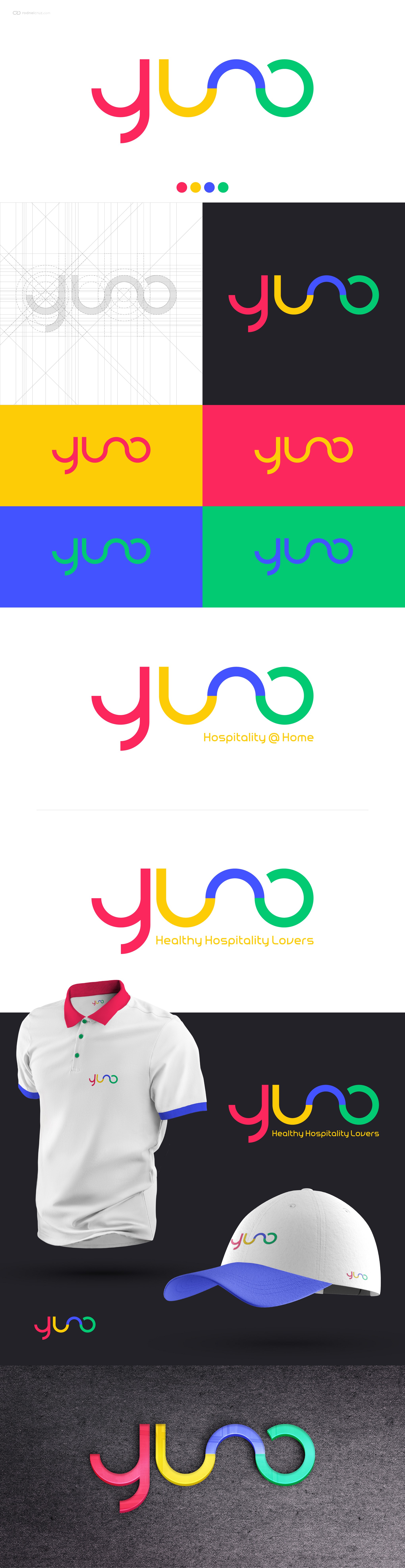
Yuno comes from the name of a Roman god (Juno). The group owned a company called Apollo Hotels (also a mythical god) and we also have another company called Hera (it's the Greek equivalent of Juno). The idea is to have a "younger" image, we changed the J for a Y.
Concept:
Yuno is in a golden circle, with cheerful colors that match each other.
Style:
Minimalist, modern, sophisticated design. The brand fits perfectly in printed materials, clothing, online materials and fits perfectly in reductions.