
Created on 99designs by Vista
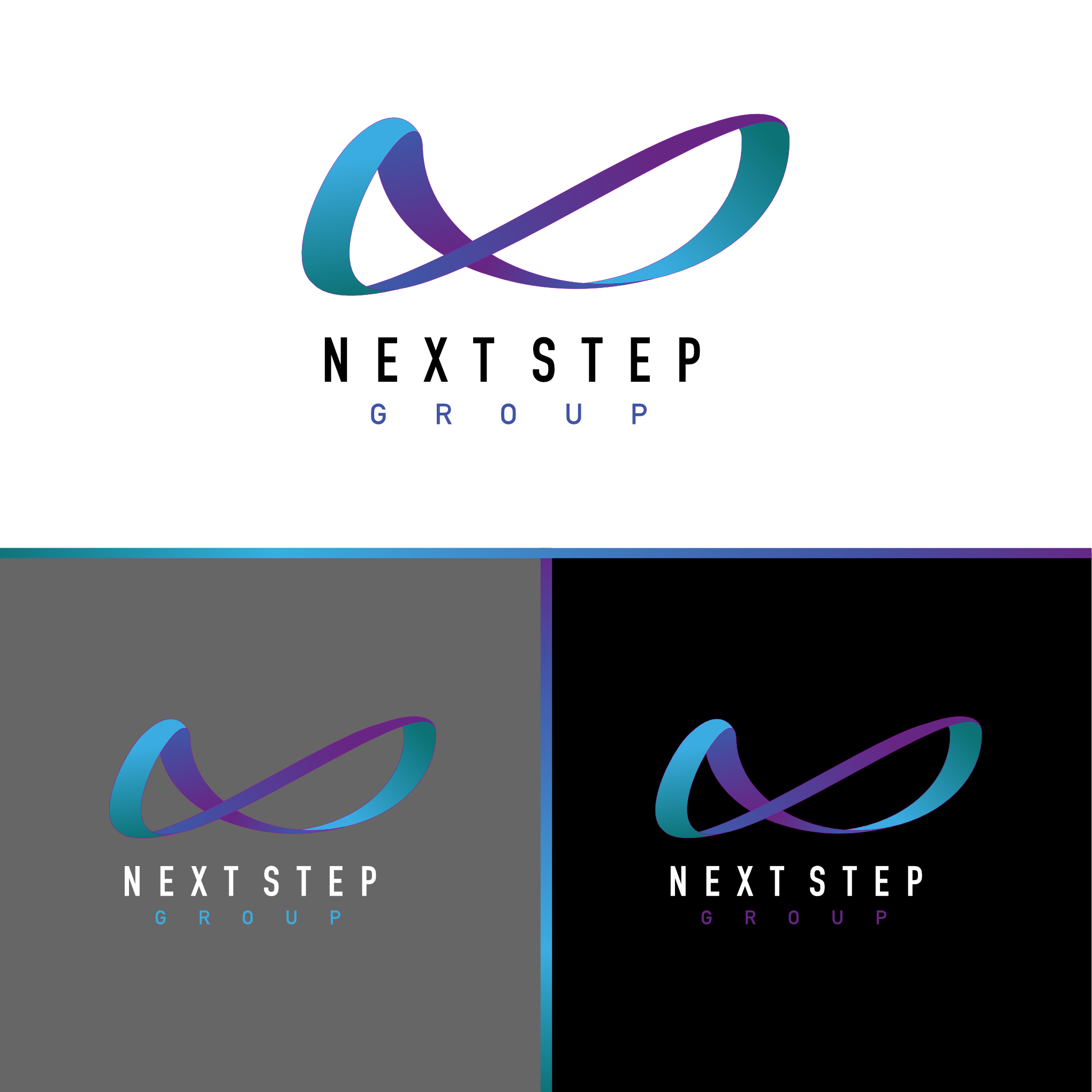
The slightly moving forward infinity symbol was chosen to signify the limitless possibilities and continuous growth of the group. Its dynamic, flowing design reflects adaptability and interconnectivity, mirroring the seamless integration of the various companies and services offered. Additionally, the fluidity of the infinity shape represents the ongoing support and trust between the group, its healthcare professionals, and its clients.
The design uses the clean, bold DIN Condensed font, displayed in all capital letters, which emphasizes professionalism and precision while ensuring clarity and readability across all mediums. This conveys trust and reliability.