
Created on 99designs by Vista
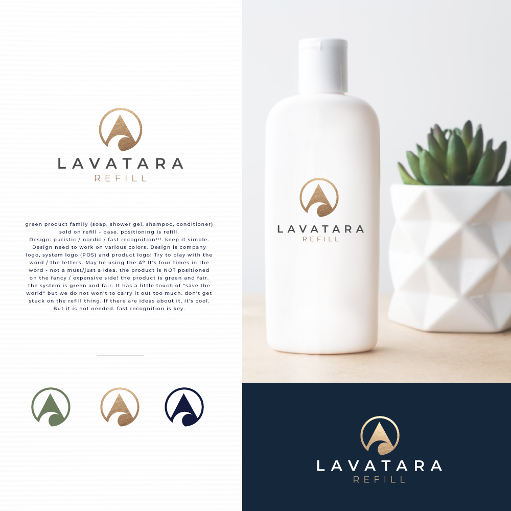
Green product family (soap, shower gel, shampoo, conditioner) sold on a refill - base. Positioning is refilled.
Design: puristic / nordic / fast recognition!!!. Keep it simple. The design needs to work in various colors. Design is the company logo, system logo (POS), and product logo! Try to play with the word / the letters. Is it maybe using the A? It's four times in the word - not a must/just an idea. The product is NOT positioned on the fancy / expensive side! The product is green and fair. The system is green and fair. It has a little touch of "save the world," but we won't to carry it out too much. Don't get stuck on the refill thing. If there are ideas about it, it's cool. But it is not needed. Fast recognition is key.