
Work: Logo concept, logo name, brand identity, packaging designs
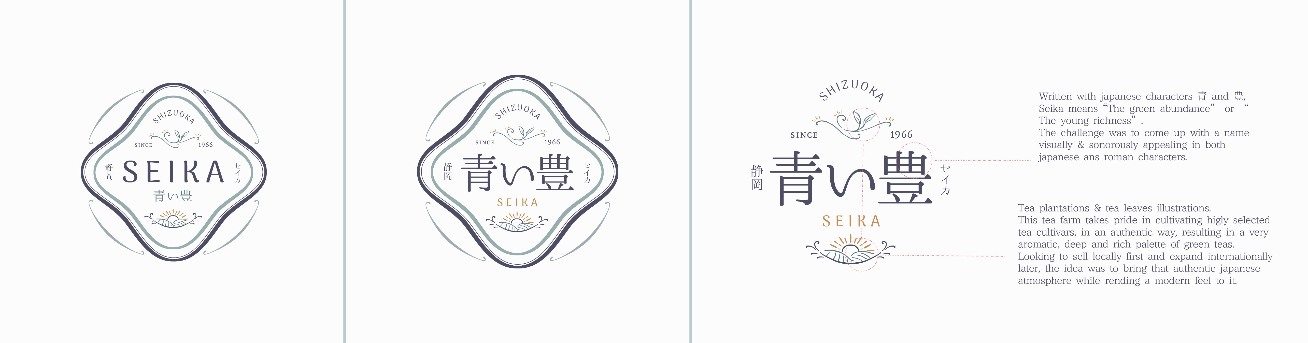
Seika is a tea farm & tea store located in the prefecture of Shizuoka, Japan.In japanese, Seika is written with 青 and 豊 meaning “The green abundance” or “The young richness”.The challenge was to come up with a name visually & sonorously appealing in both japanese ans roman characters.
This tea farm takes pride in cultivating higly selected tea cultivars, in an authentic way, resulting in a very aromatic, deep and rich palette of green teas.Looking to sell locally first and expand internationally later, the idea was to bring that authentic japanese atmosphere while rending a modern feel to it.