
Created on 99designs by Vista
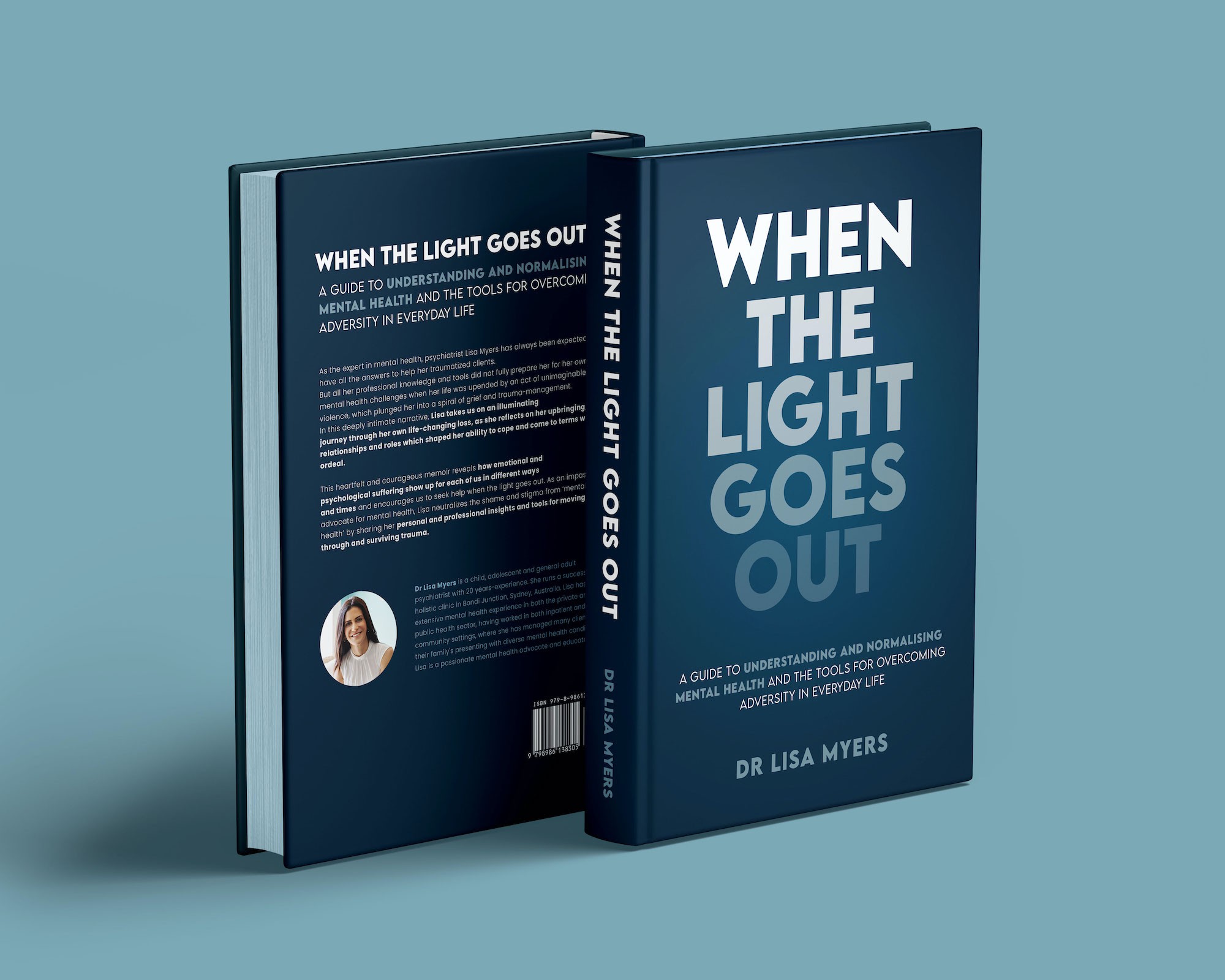
I designed a minimal cover that focused on the headline (which I find so significant in itself), bold and impactful.
At the same time I wanted to reinforce the concept that the title expresses by playing with typography, visually representing the idea of the light that goes out, using a gradient that fades out. Something simple and immediate, but not generic and linked with the title.