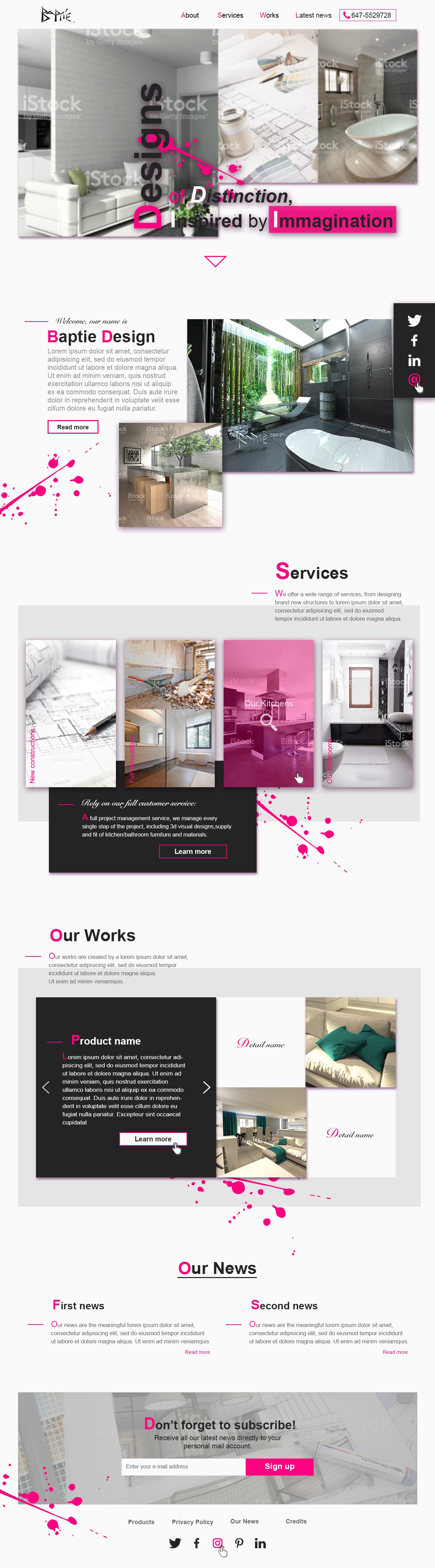
Lively Architectural Brand Website Design

0
Created on 99designs by Vista
designing this web page has been a true challenge; the result is a clean and vibrant website design for an Architect Office in UK.
The pure magenta was the only saturated color the client needed. To balance the importance of the magenta I added a lot of white space to make picture and descriptions breath more and stand out better, I took advantage of the magenta stains using them to guide the eye to the most important areas of the page, from the very top to the bottom of it.