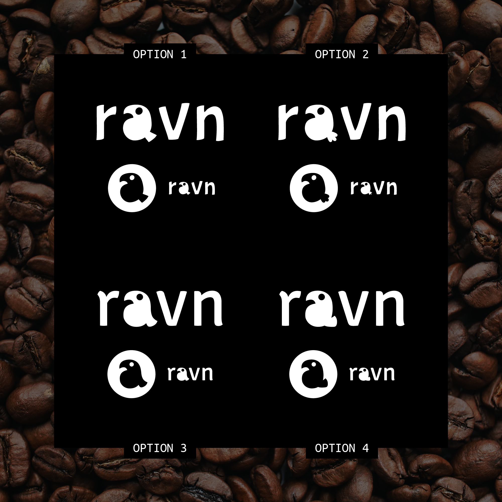
Quriky logo concept for specialty coffee company

0
Created on 99designs by Vista
The brief asked for a multi-purpose logo that was simple and stylized, so it could be easy to print on products. It also requested something quirky and fun, so I came up with the idea to play with the shapes of the letters, forming a little raven out of the "a" in the logo.
This allowed to create an easy-to-read icon, making it perfect for print and to display on screens in small sizes. This, combined with the irregular display font used here, provided the brand with a modern touch of quirkiness which transmits a lot of personality without being showy.