Grounded logo for an herbal cannabis focused company

0
Created on 99designs by Vista
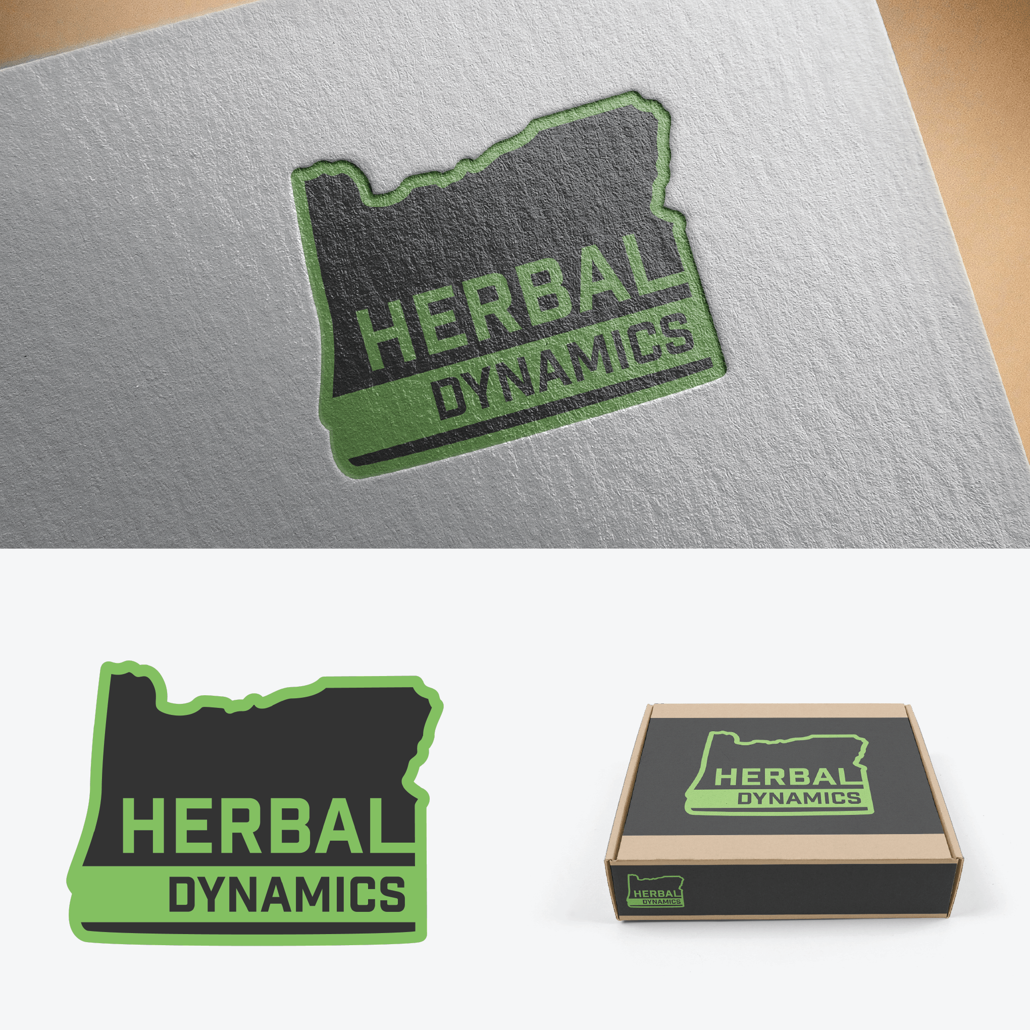
I designed this logo as a completely different design from the prior HD logo and wanted to create a more masculine design that still had hints of the herbal focus of the company.
I started with the state that the company serves, Oregon, and used its shape as a background but also as a reminder inside the logo of the origin of the company. I then used a more masculine font and made it as clear and easy to read as possible from a variety of distances. I chose the green color because it gives a hint of the herbal and plant focus of the company while not being to explicit.