Created on 99designs by Vista
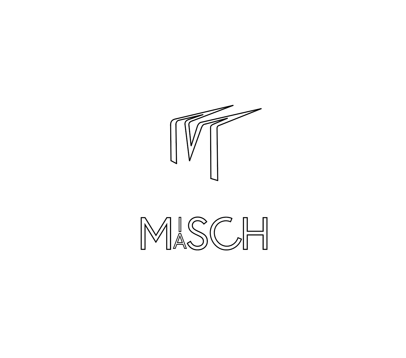
The M logo wraps around suggesting a round depth, which when tasting good beers being able to recognize the obvious notes, but upon further tasting you get a richer experience, the M alludes to a three dimensionality and structure to the beer. I made the M logo to be an open font which suggests two m's that connect making one. For the title - because it's the same word repeated twice but with different vowels I put the I and the A together allowing the title to be a literal misch masch of the word. The c is at a slight tilt to give it a playfulness but also to offer a relaxation of the 'c' rocking back that comes with a nice cold beer.
