Sophisticated, modern and attractive design.

0
Created on 99designs by Vista
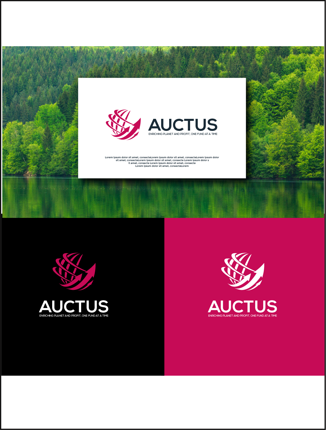
Sophisticated and attractive design. The icon is an abstract figure made up of irregular lines that give the idea of a planet with ascending arrows coming out from the bottom, referring to concepts such as balance, development, transition, profits, etc.
The chosen font is solid, attractive and easy to read thanks to its simple geometry of clean and robust lines that give it a masculine and sophisticated look.
The corporate colors are dark pink and gray, a mix that projects a serious, modern and professional image.